
color
color fields provides the end user with a color picker interface. They also validate submitted values using the TinyColor utility. Colors are saved as strings in 8 digit hex code, or #rrggbbaa, format.
Module field definition
// Configuring the `themeColor` field in a module's `fields.add` subsection:
themeColor: {
  type: 'color',
  label: 'Theme color'
}
Color Field UI
You have the ability to control and customize several parts of the color field's UI, as detailed in the options section below. 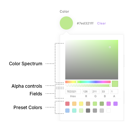
Settings
Required
| Property | Type | Default | Description |
|---|---|---|---|
label | String | n/a | Sets the visible label for the field in the UI |
type | String | n/a | Specifies the field type (color for this type) |
Optional
| Property | Type | Default | Description |
|---|---|---|---|
def | String | n/a | The default value for the field |
help | String | n/a | Help text for the content editor |
htmlHelp | String | n/a | Help text with support for HTML markup |
if | Object | {} | Conditions to meet before the field is active. See the guide for details. |
requiredIf | Object | {} | Conditions to meet before the field is required. See the guide for details. |
hidden | Boolean | false | If true, the field is hidden |
required | Boolean | false | If true, the field is mandatory |
readOnly | Boolean | false | If true, prevents the user from editing the field value |
options | Object | n/a | An object containing color picker configuration. See below. |
options
Color fields have additional settings configured in an options object:
format
Type: String
The color string format saved to the database. Possible options are:
rgbprgbhex6hex3hex8hslhsv
The default value is hex8.
backgroundColor: {
  type: 'color',
  label: 'Background color',
  options: {
    format: 'rgb'
  }
}
presetColors
An array of color values, used as swatches.
Type: Array, Boolean
TIP
Passing false will disable the preset colors UI
Default Value:
[
  '#D0021B', '#F5A623', '#F8E71C', '#8B572A', '#7ED321',
  '#417505', '#BD10E0', '#9013FE', '#4A90E2', '#50E3C2',
  '#B8E986', '#000000', '#4A4A4A', '#9B9B9B', '#FFFFFF'
]
Valid Color Strings:
Mix and match as you like.
| Format | Example |
|---|---|
| hex3 | #f00 |
| hex6 | #00ff00 |
| hex8 | #00ff0055 |
| rgb | rgb(201, 76, 76) |
| rgba | rgba(0, 0, 255, 1) |
| hsl | hsl(89, 43%, 51%) |
| hsla | hsla(89, 43%, 51%, 0.6) |
| CSS Variable | --my-primary-color |
WARNING
When using CSS Variables as presets, Apostrophe will save the CSS Variable name as a string, regardless of the format option (for example '--my-primary-color').
Usage
backgroundColor: {
  type: 'color',
  label: 'Background color',
  options: {
    presetColors: ['#ea433a', '#cc9300', '#b327bf', '#66f', '#00bf9a']
  }
}
disableAlpha
Type: Boolean
Control alpha transparency with a range input.
Default value
falsedisableFields
Type: Boolean
Disable the inputs for editing the hex & RGBA value of a color. Good for limiting the user's choices.
Default value
falsedisableSpectrum
Type: Boolean
Disable the full color spectrum UI. Good for limiting the user's choices.
Default value
falseUse in templates
<button style="background-color: {{ data.piece.themeColor or '#639' }}">
  Enhance
</button>