
Admin-bar Customization
Howdy! 👋🏻
This tutorial is available in textual and video forms. Watch the video and use this page to copy code into your project, or continue reading if you prefer. Of course, you can also do both!
The admin-bar serves as the primary interface for editors, enabling them to create new pieces and pages, manage media files, and handle user roles and permissions. Additionally, it offers access to global configuration settings, locale selection and the personal settings menu. One of its crucial functions is managing the document publication workflow, providing notification to users with appropriate permissions about documents awaiting approval.
In this tutorial, we aim to streamline the admin-bar to enhance the process of adding content to pages. We'll also touch on the process of adding custom buttons to further enhance your ApostropheCMS experience. You can either elect to make code changes as you follow along with the tutorial, or you can switch to branch sec2-7-ui-customization of the repo.
Managing menu items
Grouping items
 The left side of our current project admin-bar has a number of items that could be grouped together. The
 Images, Image Tags, Files, and File Tags buttons all open modals that allow for the management of media files. To group these items, we will make a project-level extension of the core module and pass in a groups option. Create a modules/@apostrophecms/admin-bar/index.js file and add the following code:
module.exports = {
  options: {
    groups: [
      {
        label: 'Media',
        items: [
          '@apostrophecms/image',
          '@apostrophecms/file',
          '@apostrophecms/image-tag',
          '@apostrophecms/file-tag'
        ]
      }
    ]
  }
};We are only creating a single new group with this code, but by passing additional objects in the groups array we could create as many as we would like. Each of the objects should contain two required properties, items and label.
The items array contains the names of the individual menu items you want to appear in the dropdown, listed in the order you want them to appear. Note: Menu names for piece-type items are the name of the piece-type, not the label. For core items, like 'Images', the name is prefixed - @apostrophecms/image.
The label property provides a label on the admin-bar that is displayed to the user. If your project has several locales configured, this string should also be added to your project translation JSON files. In this case we are modifying both of our project files to include one new line at the end of each file.
{
  "apostropheProductReviews": "Apostrophe Product Reviews",
  "findTheBest": "Find the best",
  "becomeAMember": "Become a member",
  "Media": "Media"
}{
"apostropheProductReviews": "Apostrophe Produktbewertungen",
"findTheBest": "Finden Sie das Beste",
"becomeAMember": "Werden Sie Mitglied",
"Media": "Medien"
}The quick create menu
By default, the quick create menu is located after the other menu items on the left side of the admin-bar and contains buttons for creating a new page and any custom piece-types. Clicking these buttons will skip the opening of the initial manager modal and opens a new item for editing directly. You can elect to block this default behavior by setting the quickCreate option to false in the /modules/@apostrophecms/page/index.js file for pages, or any custom piece-type module.
Creating a custom menu item
The creation of a custom menu item is a two-step process. The first step is to add the button to the admin-bar using the add() function of the @apostrophecms/admin-bar module. The second is to add browser-side JavaScript to respond to the listener that Apostrophe adds to the admin-bar. We won't be using a custom button in this project, but it is a worthwhile exercise to add one to understand where to best add the code for future projects.
Adding the custom button

We are going to add the button through our custom review piece-type module. Open the modules/review/index.js file and insert the following code:
init(self) {
  self.apos.adminBar.add('customButton', 'Custom', false, {
    contextUtility: true,
    icon: 'anchor-icon'
  });
},The first argument is the name that will be emitted when the button is clicked. It should be unique, and we will return to this when we look at how to listen for the click event.
The second parameter specifies the label that appears on the button in the admin bar. If the menu item shows as an icon, this label will still be included but assigned a apos-sr-only class, making it accessible to screen readers while remaining hidden on the menu bar.
The third argument is the permissions required for a user to be able to see the button based on the action that it will perform. Setting it to false will let any logged-in user view and click the button. Delving into the object of actions and types this argument can take is beyond the scope of this tutorial, but is covered in the documentation.
The final argument is an optional object of properties that dictate the position and display of the custom button. If you are adding multiple custom buttons, they are added in the order that the modules are registered in the app.js file. Setting the last option to true will place the button just to the left of the quick create menu icon, irrespective of when it is registered. The contextUtility option also takes a boolean value and if set to true will cause the button to show up on the right-hand side of the admin bar before any potential localization or the personal settings menu. If you set this option to true you must also set the icon option to a registered icon name as was covered in the Creating Widgets tutorial - you can also read about this in the documentation.
Adding button functionality
Now that we have a button added to our admin bar, we need to add JavaScript code to the front end to make it functional. Code that extends the app functionality is typically added into the ui/apos folder of the module. Within this folder there can be any number of folders, but two common folders are the components and app folders. The components folder is used when adding custom Vue components to the admin UI. In this case, we are going to add code to the app folder. This code will be added to the public/apos-frontend/<releaseid>/apos-build.js file at build time. This is in contrast to the JavaScript code we added to the ui/src/ folder of the ratings-widget that gets compiled into the src-build.js in the same folder.
Create a modules/review/ui/apos/apps/customButton.js file and add the following code:
export default () => {
  apos.bus.$on('admin-menu-click', async (name) => {

    console.log('admin-menu-click received for button named: ', name);
    // Make sure it is the button we care about, leave others to their own handlers
    if (name !== 'customButton') {
      return;
    }
    // Add the code that needs to run when the button is clicked here
    console.log('The custom button was clicked!');
  });
};The apos.bus helper allows you to listen for bus events emitted by any other module. In this case, one of the admin-bar Vue components emits the name of which button was clicked using apos.bus.$emit('admin-menu-click', name);. The code above "listens" for the admin-menu-click emission and passes the button name into the callback function. Just for fun, we are logging what button was clicked. Next, we test whether the passed name matches our custom button name and returns early if it doesn't. Otherwise, we run our custom code to perform our custom button function.
We can bring our project up and test the button functionality. It is good when altering the admin UI to start your project with the APOS_DEV environment variable on using APOS_DEV=1 npm run dev. This forces a rebuild of the UI. Normally this is turned off to save build time between code changes. Once your project is up, and you are logged in, you can click on any button in the admin-bar. This will result in a message being logged to the browser console - remember that this is browser-side code, not server side code. The message should have the name of the button that was clicked. If you click the new custom button, it will log the additional message. Note that the dropdown menus, like the quick create menu, will not emit an event.
Customizing the personal settings menu
The @apostrophe/settings module allows you to customize the dropdown menu on the right side of the admin-bar. When this module isn't configured this menu shows the user's display name that was set through the Users manager modal and can be used to logout. Any schema field that have been added to the @apostrophecms/user module either in core or at the project-level can be modified in the personal settings menu. This menu can also be configured to allow the user to select to have the admin UI language remain fixed when they change locales. This requires that the adminLocals option of the @apostrophecms/i18n modules be set.
Configuring the @apostrophecms/user module
Open the modules/@apostrophecms/settings/index.js file and replace the existing code with the following:
module.exports = {
  options: {
    subforms: {
      changePassword: {
        // This will have `protection: true` automatically.
        fields: [ 'password' ]
      },
      displayName: {
        // The default `title` field is labeled 'Display Name' in the `@apostrophecms/user` module.
        // Changing this field will **not** change the Username or Slug of the user.
        fields: [ 'title' ],
        reload: true
      },
      fullName: {
        // Passing in a label so that it doesn't use the label for `lastName`
        // These fields need to be added to the user schema
        label: 'Full Name',
        // Schema fields added at project level
        fields: [ 'lastName', 'firstName' ],
        preview: '{{ firstName }} {{lastName}}'
      },
      // The `adminLocales` option **must** be configured in the `@apostrophecms/i18n` module for this to be allowed
      adminLocale: {
        fields: [ 'adminLocale' ]
      }
    },
    groups: {
      account: {
        label: 'Account',
        subforms: [ 'displayName', 'fullName', 'changePassword' ]
      },
      preferences: {
        label: 'Preferences',
        // The `adminLocales` option **must** be configured in the `@apostrophecms/i18n` module for this to be allowed
        subforms: [ 'adminLocale' ]
      }
    }
  }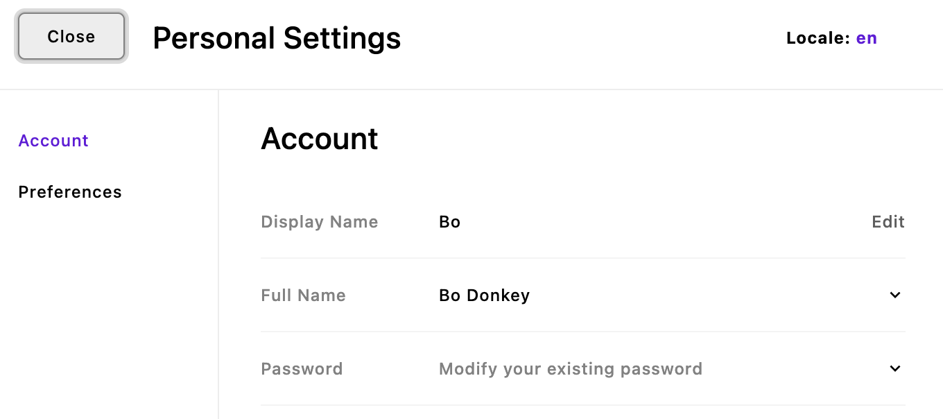
};Walking through this code, you can see that the menu is configured through the subforms and groups options. In this case we are adding four subforms, items that will show up as editable fields in the menu, grouped into two tabs.
The first item we are adding will allow the user to change their password. The only configuration we are adding to the object is the required fields key. This property takes an array of strings that are the names of schema fields set in either the @apostrophecms/user module, or in one specific case, the @apostrophecms/i18n module. As noted in the code comments, this field is configured in the core module to automatically have a protection: true property. This will require the user to enter their password in order to change this field. This same property can be added to any subform object to require a password. The password field also automatically sets the help property of the subform to display 'Modify your existing password' to the right of the label, rather than the actual password. The help string for any subform can be localized to display in the user's preferred language by adding the text of the string to the appropriate language JSON files.
The second item we are adding is the displayName. This will alter the value of the existing title field in the user schema. Note that within the Users manager the slug and username fields follow the title. Changing the display name from the Users manager will alter these two fields, however, these fields will not be altered when using the personal settings menu. We are also adding a reload: true property. This will cause the site to reload after the information in this field is updated, otherwise the display name wouldn't change until the user manually refreshed the page. We don't need to add a label property because the @apostrophecms/settings module will automatically use the label for the title field from the existing @apostrophecms/user module configuration. We also don't need to set up a value to display to the right of the value since we are only modifying a single field, the module will automatically display the input value.
The third subform we are adding will actually alter the value of two user fields, lastName and firstName. In this case we are passing the label property to set what is displayed to the user. Otherwise, the module would use the label for the first schema field added to the fields array - in this case, lastName. We are also adding a preview property with a string that looks like Nunjucks templating. This actually leverages i18next as a templating system, allowing us to reorder and localize the input to match the preferred locale. In place of preview or help, we could also use the previewComponent property to add a custom Vue component for modifying and displaying the input. You can read more about this property in the reference documentation.
Finally, we are adding an input so that the user can change their preferred UI language. As explained in the code comment, this needs to be further configured in the @apostrophecms/i18n module to be functional.
The groups options works in the same way as the schema fields groups option. Each of the subform items can be added to a named tab with a label property and an array of subforms names added to the subforms property.
Configuring the @apostrophecms/i18n module
Open the modules/@apostrophecms/i18n/index.js and modify the options to include:
adminLocales: [
  // you can add an object for as many or few of the locales as desired
  // the user will only be able to select from these locales in the personal preferences menu
  {
    label: 'English',
    value: 'en'
  },
  {
    label: 'Deutsch',
    value: 'de'
  }
],
// This will cause the admin UI to always use the English locale
// unless the user deliberatly selects another language, or
// for the UI language to change with the selected locale
defaultAdminLocale: 'en'Adding the adminLocales to your @apostrophecms/i18n module options will automatically add a menu for language preference to the Users manager. Our @apostrophecms/settings module configuration will add it to the personal settings module.
Configuring the @apostrophecms/user module
Create a modules/@apostrophecms/user/index.js file and add the following code:
module.exports = {
  fields: {
    add: {
      firstName: {
        type: 'string',
        label: 'First Name'
      },
      lastName: {
        type: 'string',
        label: 'Last Name'
      }
    },
    group: {
      account: {
        label: 'Account',
        fields: [
          'firstName',
          'lastName'
        ]
      }
    }
  }
};In this code we only need to add the firstName and lastName fields. All the other fields, like title or changePassword already exist in core or are added by other modules.
Summary and next steps
In this tutorial, we focused on enhancing the functionality and user experience of the admin-bar in ApostropheCMS. We began by organizing related menu items into a single group to make navigation more intuitive. Additionally, we explored how to add a custom button to the admin-bar and walked through the process of adding front-end JavaScript to make this button functional. Finally, we covered how to customize the personal settings menu, allowing users to change their passwords and display names directly from the admin-bar.
This only scratches the surface of the modifications that can be made to the admin UI. In addition to changing the admin-bar, you can also add custom schema fields, custom manager modals, customized @apostrophecms/rich-text-widget controls, and more. You can read about these modifications in our documentation pages.
Next, we are going to look at how to add an extension from Apostrophe's library of modules. Not only are these extensions useful for adding functionality to your projects, but they are also useful for better understanding the Apostrophe codebase. We will use this as an opportunity to look at how we can bundle our own custom modules that can be brought into multiple projects.